Full Length Research Paper
ABSTRACT
This study examined what is believed to be “real” in images and how people – particularly non-experts – respond to and understand information that astronomical images attempt to convey. A convenience sample of 1,956 responded to an online survey created for this research. Results indicated that belief in the veracity of astronomical images is normally distributed, with males somewhat more unconvinced than females. No significant differences were shown across age groups, levels of education, background in astronomy, and self-rating of knowledge in astronomy. An open-ended item soliciting questions for a science image expert yielded five primary categories of responses: color, veracity, “The Five W” questions, technical questions, and comments or questions related to the aesthetics of the image. By far, the majority of questions and comments are related to color. Results are discussed in terms of the need for more education regarding science communication and for using technology to increase public understanding and comprehension of images related to astronomy and other issues in science.
Key words: Astronomical images, images as truth, science communication, processed color.
INTRODUCTION
On February 26, 2015, when a large chunk of the Internet exploded in uproar over the perceived color of a woman’s dress, it presented a micro case study in color perception. Was the striped dress colored gold and white or was it really black and blue! Debates erupted between spouses, colleagues, neighbors, as well as online between perfect strangers (see http://www.nytimes.com/interactive/2015/02/28/science/white-or-blue-dress.html?_r=0). Colors can be seen differently from person to person due to technical issues (such as monitor calibration), how a person’s eye functions (what the rods and cones are doing), and even information from a cultural context (such as describing the sky as blue versus green). What happens then, when the color being discussed comes not from a dress that the viewer in all likelihood will never actually wear, but a scientific image that is trying to convey meaning behind the data?
Images of science can be considered a powerful tool for communication (Frankel, 2004), resonating with both expert and non-expert populations (Smith et al., 2010). If seeing happens before reading (Berger, 1972), or if for some populations, seeing is believing (certainly an old idiom), there is a need for a greater understanding of the impact of such visuals on their intended audiences to inform the process of image creation and dissemination. It is particularly important to understand viewer’ perception and comprehension when considering the availability for viewers to access gigabytes of space images digitally, across a range of platforms (Smith et al., 2014). Indeed, the very concepts of “understanding” and “perception” would be contested in examining incredibly scientifically complex areas such as astrophysics and climate change. Our use of the terms “understanding,” “perceiving,” and “perception” are used in this paper in a somewhat colloquial fashion. This is not intended to ignore the scholarship in this area; for an extended discussion of such consideration, we recommend the work of Les and Les (2015).
Astronomical images exist at an intersection of science and art, of information and aesthetics, of the contextual and the visual (Smith, 2014). On the one hand, they are translations. They are data based representations (Arcand et al., 2013) of objects that are incredibly far away from direct human experience in space and time. On the other hand, they often exhibit photo-realism, as if they claim to be super-sized “selfies” of the sky.
Related to the extensive discussions in scholarship and popular media on equating the photographic “image as truth” (Schwartz, 2003) and “record of the real” (Rothstein, 2010), astronomy has an historical context in which observatories were thought to function like a giant eyeballs on the Universe from which cosmic objects could quickly be recorded and filed (Schaffer, 1998).
It could be said that images of the Universe provide a pipeline of purposes from the professional (recording data of the cosmos at specific times and places, assisting scientists in understanding the data collected) to the experiential (triggering aesthetic experiences, and having an impact on public support for scientific funding) (Kessler, 2012; Huppauf and Weingart, 2008; Snyder, 2011).
But when it comes to understanding color in astronomical images, an additional layer of complexity – or reality – is added. The majority of images from modern observatories start out as digital natives (versus photo-graphic plates). In the case of space-based observatories, the primary focus in this paper, photons emitted from the cosmic objects are recorded (their energy, time, location, etc.) by instrumentation on the telescopes that are coded as values in the forms of ones and zeroes that are then sent via NASA’s Deep Space Network to the scientific teams for processing. The data are eventually translated into the visual representation of the object, at which point the image is black and white. The information recorded by the instruments captures differences in brightness, without any inherent color (Arcand et al., 2013). Color must be added - even if the data recorded are in visible light.
In many cases, the data come from a range of light outside of that small slice that human eyes evolved to see. Multiple stacks of data, such as from “invisible” forms of light: radio, microwave, infrared, ultraviolet, X-ray, or gamma ray, can be combined into a single composite image (Rector et al., 2007). The meaning of the colors may even be perceived as foreign or possibly fake when it is learned that the colors are applied after the observations are complete[i]. The standard name used by astronomers for colorizing - “false color” - might even encourage this perception (Christensen et al., 2009). In false coloring, also known as “representative coloring,” one color is assigned to one slice or section of the information (in this case, light), with a second color assigned to a second slice of information, and so forth, until the final combined color image is created by the scientist or science image processor.
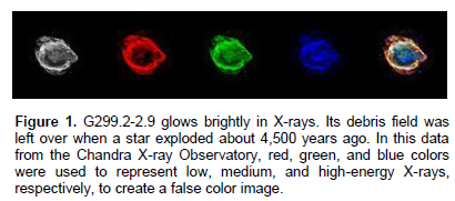
For example, X-ray data of an exploded star can be divided into three distinct cuts of energies (low, medium, and high energy) with a different color applied to each cut to create a final 3-color image, in this case, as red, green, and blue, respectively (Figure 1) (Rector et al., 2015). The applied color adds to the overall information quotient of the image (Arcand et al., 2013), imbuing more value into the visual representation. Such colorizing provides details that can be viewed more easily by the eye than if the image were simply in black and white, such as which areas of the image might show heavier densities of a particular element, or which parts of the image might have a higher concentration of superheated gas.
[i] See for example, Kessler’s discussion of the response to the exaggerated colors of Hubble images, p. 153; or this review of true and false colors of space science images as related to an exhibition at the Smithsonian’s National Air & Space Museum http://www.nytimes.com/2010/07/29/arts/design/29museum.html?_r=3&ref=arts)
Therefore, there is a clear need to establish how viewers of varying levels of expertise understand and subsequently interact with images of deep space. This research was designed to learn how best to build confidence in the veracity of the images, ensure the comprehension of the information accompanying the images, and further understand and also potentially increase viewers’ aesthetic appreciation of the images. Consequently, this study examined what is believed to be “real” in images and how people – particularly non-experts – respond to and understand information that astronomical images attempt to convey. The research questions were:
1. How much do viewers trust that what is depicted in an image is an accurate representation?
2. Which color presentations best convey the intended scientific message underlying an image?
3. Which color presentations are most aesthetically pleasing and interesting?
4. How does the combination of smoothing and choice of color contribute to the appeal of an image and the communication of its text information?
METHOD
Participants
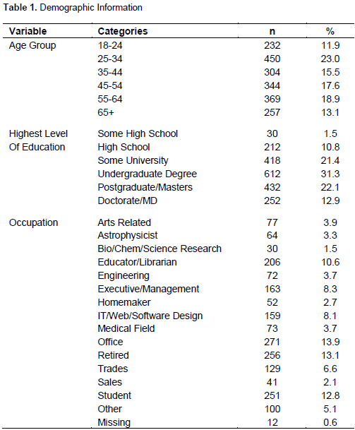
The participants were a convenience sample of 1,956 respondents to an online survey. Only participants 18 years and older were included in the study. Males comprised 2/3 of the respondents (67.5%, n = 1,320 male; 32.5%, n = 636 female); the median age group was 35-44 years. The participants reported being well educated with only 14% of the sample not having at least an undergraduate degree. A variety of primary occupations were represented, with 6.7% (n = 131) reporting that they work in a field related to astronomy (See Table 1 for complete demographic data).
(33.8%), whether they belong to an amateur organisation related to astronomy (3.4%), and whether they had studied astronomy in high school (12.3%) or university (21.6%). Only 12.5% of the sample reported having no background in astronomy and 5.1% stated that they were professionals in the field.
Materials
A survey written for this study used seven demographic items from previous research by the A&A group. These were followed by a series of items designed to determine the extent to which the participants comprehend what they are viewing when they look at astronomical images: their beliefs in how accurately the images portray actual objects in space; which explanatory texts, color schemes, and levels of smoothing communicate the underlying science for the images; and, what types of images are perceived as aesthetically pleasing and interesting. Participants then worked though a protocol that allowed them to make choices about various options for images, ultimately creating “their own” image of a black hole jet. Then, the image of the black hole that had been made by an image expert was shown next to the participant’s image. Participants were then asked what questions they might have for the professional image maker. The survey concluded with two items that explored whether the participant’s understandings of and reactions to astronomical images might have changed, given the information that was presented within the survey items.
Procedure
The survey was deemed exempt by Harvard University’s Institutional Review Board; submission of the survey constituted consent. Participation was solicited from websites including http://chandra.si.edu, http://apod.nasa.gov, http://astroart.cfa. harvard.edu/, and http://www.cfa.harvard.edu, as well as through social media sites such as the Facebook and Twitter accounts for Chandra and the Smithsonian, @chandraxray, @sitesExhibits, and @SIAffiliates, and an online user-testing group for the Smithsonian. No compensation to participants was provided.
The survey was active during the last two weeks of July 2014. Data were captured into an Excel file and imported to SPSS Version 22 (IBM Corp, 2013) for analysis of the quantitative data. The open-ended responses were imported into NVivo for Mac Version 10.2.0 for qualitative analysis.
RESULTS
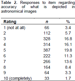
The first research question concerned the level of trust that viewers have in the accuracy of what is depicted in astronomical images. To examine this, participants were asked, “In general, how accurately do you think astronomical images portray the actual objects in space? Use a scale of 1 (not at all) to 10 (completely accurate)”. Responses (Table 2) indicated a wide spread of responses, with a mean = 5.05 (SD = 2.06). In general, viewers ranged from complete disbelief in the accuracy of the images to complete belief in them, in what is a relatively normal distribution. Probing a bit deeper, the responses to this question were examined in relationship to viewers’ age, gender, level of education, background in astronomy, and self-rating of knowledge in astronomy. Surprisingly, only gender proved to be statistically significant, with males (M = 4.93, SD = 2.06) more skeptical than females (M = 5.31, SD = 2.03), t (1954) = 3.84, p < .001. Even here, the effect size using Cohen’s d was only .18. For all other variables, there was no relationship with response to the question. Viewers with high levels of astronomy knowledge responded to the question in the same fashion as those with low levels, specifically, with a broad range of responses going from 1 to 10. This is discussed below.
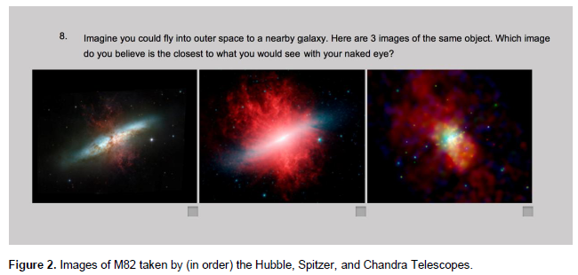
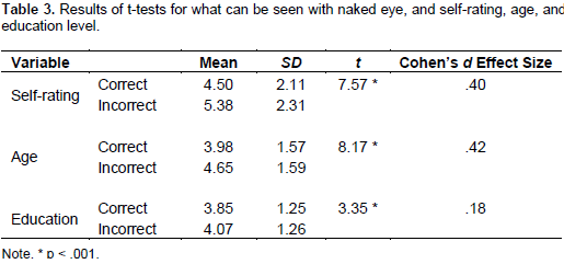
Participants were also asked to imagine that they could fly into outer space to a nearby galaxy. Based on that, they were asked to choose which of three images of galaxy M82 that they believe would be closest to what they would see with the naked eye (Figure 2). Three-quarters (74.8%) of the sample correctly selected the optical image taken by the Hubble Telescope; 8.0% selected the infrared image from the Spitzer Telescope and 17.2% selected the X-ray image from the Chandra X-ray Observatory. To explore this in depth, the responses were recoded into a dichotomous variable (correct/ incorrect) and a series of statistical tests using the demographic variables were conducted. The dichotomous variable was used as the independent variable in three t-tests, with self-rating, age, and level of education as the dependent variables. As shown in Table 3, all tests were statistically significant at p < .001. Those with higher self-ratings, a higher level of education, and who were older were significantly more likely to choose the correct image. It is interesting to note that for self-rating and age, the effect size using Cohen’s d approaches half a standard deviation. Chi-square tests were used to explore the variables of background in astronomy and gender. For background, there was a significant Chi-square, X2 (6, N = 1,956) = 40.42, p < .001. Those who reported being members of amateur astronomy organizations, having taken one or more courses in astronomy at the university level, or being professional astronomers were most likely to have chosen the optical image. For
gender, there was a significant Chi-square, X2 (2, N = 1,956) = 19.72, p < .001, with males being more likely than females to choose the optical image.
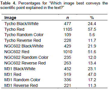
The second research question explored how color presentation helps to visually convey the intended scientific message for that image. Therefore, the focus for this question was primarily on the image. A series of items were used to explore this issue. First, four versions of the Tycho supernova remnant were presented with accompanying text. The first image was in black and white; the second image was primarily red with medium green and high blue levels of color; the third image was shown in a randomly chosen color; and, the fourth image was opposite to the red image, with high red, medium green, and low blue coloration. This format was repeated for images of star-forming region NGC602 and the Andromeda Galaxy (M31) (Figure 3). For each image, participants were asked, “Which image best conveys the scientific point explained in the text?” As shown in Table 4, the majority of the participants (47.0% to 57.5%) chose the red coloration for each of the images, which is in agreement with the choice of the image expert who selected those images for the study.
As with the first research question, the responses to these images were further examined in a series of statistical tests. Self-rating, age, and education were used as dependent variables in an analysis of variance (ANOVA), with the choice of image for Tycho as the independent variable. Given the size of the sample, alpha was set to .01. There were no significant main effects or interactions for Tycho, NGC602, or M31. Chi-square analyses for gender and background yielded no significant differences for Tycho; however, the chi-square analyses were significant for NGC602 and M31. For gender, males were significantly more likely to select the “correct image” (image selected by the image expert) as compared to females (For NGC602, X2 (3, N = 1,956) = 13.06, p < .01; for M31, X2 (3, N = 1,956) = 13.77, p < .01). For background, those with professional back-grounds were significantly more likely to select the correct image than any other group (For NGC602, X2 (18, N = 1,956) = 42.01, p < .01; for M31, X2 (18, N = 1,956) = 41.88, p < .01). For NGC602, professionals selected the correct image 70% of the time, compared to 40% for those with no background, and 49% to 57% for the other groups. Males selected the correct image 54% of the time, females 47% of the time. For M31, professionals selected the correct image 58% of the time, compared to 37% for those with no background, and 39% to 51% of the time for the other groups.
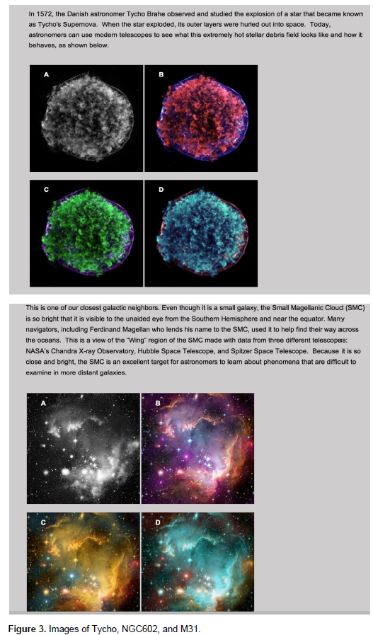
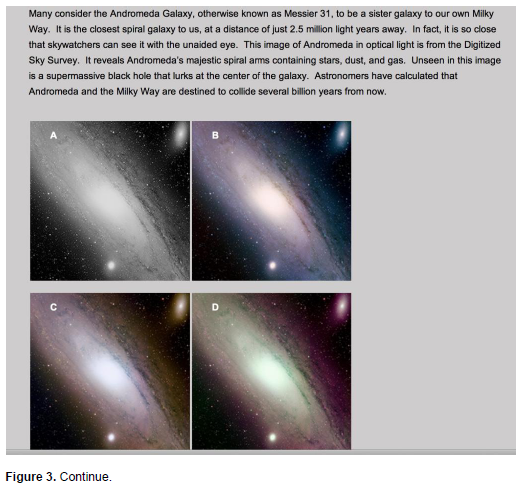
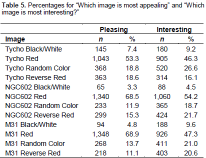
The third research question concerned the aesthetics of images. To explore this, two additional items were used with the images of Tycho, NGC602, and M31. Specifically, for each image, participants were asked to choose which was most pleasing and which was most interesting from among the four images shown. As Table 5 shows, in each case, roughly half to two-thirds of the participants chose the image with the red coloration - the one selected by the image expert as the correct image for the science text - as most pleasing and most interesting. In each case, the black and white image was rated as least pleasing and interesting.
These responses were further examined in a series of statistical tests. Self-rating, age, and education were used as independent variables in analyses of variance, with the choice of image as the dependent variable. Given the size of the sample, alpha level was set to .01. There were no significant main effects or interactions for Tycho or NGC602, and only one main effect for M31, which was for pleasing as the dependent variable and self-rating as the independent variable (F (9,1628) = 2.90, p < .01). A Scheffé post-hoc test did not indicate any significant differences among the self-ratings. Chi-square analyses were calculated for gender and background, with three significant results. First, for background, for M31/interesting, those who reported astronomy as being a hobby were significantly more likely to select the randomly colored image as interesting, and those who reported their background as amateur astronomers were significantly more likely to select the black and white image as interesting, as compared to the other groups (X2 (18, N = 1,956) = 35.34, p < .01). For gender, for NGC602/interesting, females were more likely than males to select the random coloration or the image that was opposite in color composition to the red (correct) image, that is, the image that was colored high red, medium green, low blue (X2 (3, N = 1,956) = 22.43, p < .01). For M31/interesting, females were significantly more likely than males to select the image that was opposite in color composition to the red (X2 (3, N = 1,956) = 28.29, p < .01).
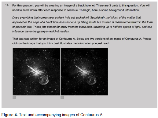
For the fourth research question, participants were led through a protocol designed to examine how the combination of smoothing and choice of color contribute to the appeal of an image and the communication of accompanying text. The participants were told that they would be creating an image of a black hole jet. They were then asked to read this background information: “Does everything that comes near a black hole get sucked in? Surprisingly, no! Much of the matter that approaches the edge of a black hole does not end up falling inside but instead is redirected outward in the form of powerful jets. These jets extend far away from the black hole, travelling up to half the speed of light, and can influence the entire galaxy in which it resides”.
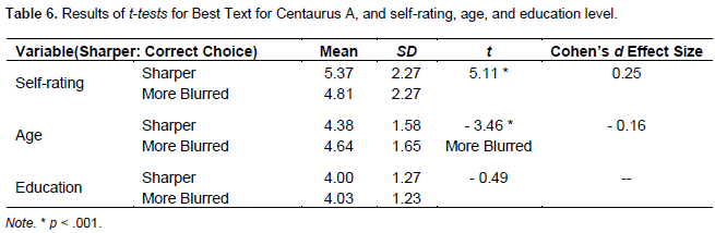
Participants were then shown two versions of Centaurus A and chose which of the two images best illustrated the text (Figure 4). Two-thirds (n = 1,305, 66.7%) of the sample chose the sharper image, which again agreed with the image expert who selected the images for the study. Three t-tests were calculated, with self-rating, age, and level of education as the independent variables and the choice of image as the dependent variable. As shown in Table 6, those with higher self-ratings, or who were younger, were significantly more likely to choose the correct image; the results for level of education were not significant. The effect size using Cohen’s d was ¼ of a standard deviation for self-rating (relatively small). Chi-square tests were used to explore the variables background and gender. For background, there was a significant Chi-square, X2 (6, N = 1,956) = 21.69, p < .01. Those who reported being professional astronomers were most likely to have chosen the sharper image. For gender, there was a significant Chi-square, X2 (2, N = 1,956) = 54.46, p < .001, with males being more likely than females to choose the sharper image.
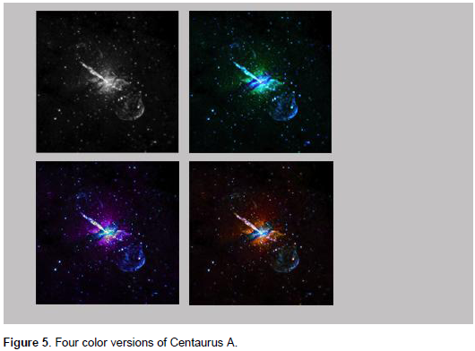
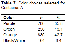
On the next screen, whichever image had been chosen by the participant (sharper or more blurred) was presented in four different color versions: purple, green, orange, black/white (Figure 5). The image expert for this study indicated that the orange image was the preferred option, as far as standard chromatic ordering, which is often used in astronomical image processing, but this was not conveyed at this point to the participant. The participant was then asked to choose which of the four images was most appealing. The overall selections are shown in Table 7. It can be seen that although the orange image was selected most often, the purple image was also very appealing to the participants.
Participants were then shown the image that they had created on the left side of the screen, with the image of Centaurus A by the image expert on the right side of the screen. An explanation of why the image expert chose those colors and smoothing was provided, along with a definition of smoothing. The participants were then asked to write in their response to the question, “If our image expert were with you, what question would you ask about this image?” A total of 1,092 participants asked questions or made observations about the image, and some participants asked multiple questions. Thirty-two participants indicated that the explanation provided was clear and they had no further questions; the remaining participants left this item blank.
Five broad categories emerged from the responses. These were: color, veracity, “The Five W” questions, technical questions, and comments or questions related to the aesthetics of the image. By far, the majority of questions and comments related to color. Given the range of expertise of the sample, it is not surprising that some questions were simply stated and in some cases, indicated a level of naiveté regarding the underlying science, while others showed more sophisticated levels of understanding. After each quote, gender and self-rating of the respondent is provided in parentheses.
In terms of color, a total of 564 responses asked how or why the colors were selected, whether the colors were accurate, “true” representations or artificial, and what the colors (or kinds of light) represented or signified. It should be noted that in many cases, questions for this category overlapped with the other categories, either because the participant asked more than one question, or combined a question about color with a question from one of the other categories. Therefore, only questions that primarily related to color were included in this count. Examples of the responses related to color were:
1. Does the right image have the real color of Centaurus A? (F, 6)
2. Are these the colors we would see if we viewed this object with the naked eye? (F, 3)
3. How do you select colors that best demarcate the barriers between different parts of the object (gas, jets, etc.)? (M, 7)
4. How do the colors relate to wavelengths? (M, 3)
5. Why do the colors change with smoothing? (F, 4)
6. Does the jet create color discrepancies from the amount of energy being expelled by its force? (M, 2)
The second category, veracity, comprised 310 questions related to whether the image was real, whether it was what we really see, how much manipulation was done to produce the image, and why the image expert didn’t simply show the real image or the raw data. Questions and comments in this category overlapped in some cases with questions about color; only those questions primarily concerned with veracity of the image are included in this count. Examples of the responses related to veracity were:
1. Is this process real? Is it really capturing the true image of Centaurus A? (F, 8)
2. Is it a real galaxy or photoshopped? (F, 7)
3. Did you use Photoshop? (M, 4)
4. Is the image just to show to the public or to do real science? (M, 8)
5. Is the crisper detail on the image artificially created by your processing? (F, 9)
The third category is related to “The Five W” types of questions, the who, what, where, when, and why of the images. Sometimes referred to as “tombstone data,” there were 287 responses that fit into this category. Many of the questions related to the actual location of the image, smoothing of the image, and what particular aspects of the image depicted. As with the questions about color, there was a range of sophistication demonstrated. Some examples of responses from this category were:
1. Who decides on the true image, a computer, a committee, the Guy with the Mouse? (M, 5)
2. What is the bright, round object at the center of the image? (F, 3)
3. Where is the black hole actually located? (M, 3)
4. When you are processing an image, how do you know when to stop? (F, 7)
5. Why is the jet one-sided? (M, 8)
The fourth category concerned questions that were more technical in nature. There were 193 questions related to issues such as data loss, noise, pixel value, and the smoothing algorithm, either individually or in combination. It is interesting to note that several of these comments have undertones of responses related to veracity, but specifically bringing in more technical issues. Examples from the responses from this category were:
1. Despite the intention of the smoothing algorithm, does the process introduce other image artefacts or result in the loss of useful data? (M, 6)
2. Is small-scale detail and variation not lost in the smoothing process or does the uncertainty from the noise outweigh the natural differences making the raw data inaccurate? (F, 7)
3. How do you distinguish real but transient data from noise? (M, 8)
4. Even just one pixel can represent a large area at this distance, how do you know you are not modifying actual data? (M, 5)
5. Can you apply the smoothing algorithm more than once? If so, how do you measure the number of times needed to improve the image without losing information? (F, 7)
The final category, albeit a smaller one in terms of number of responses, is worth mentioning. This category primarily encompassed comments about the aesthetics of the image. Forty-nine comments used words like beauty, wonder, and amazing to describe the image in the study or astronomical images in general. Where questions were raised, they were typically with relation to the other categories. Some examples of these comments and questions were:
1. I would just say: That’s why you’re the expert! Your picture is amazing! :) (F, 5)
2. I find space to be so beautiful, but I wonder how much “enhancement” images get. How much color is added?
3. Why is it added (if it is)? I don’t think it’ right to manipulate things to “sell” them, and I would think science-minded people would agree. (M, 3)
4. What color do people find most appealing when viewing images in space? (F, 1)
5. I like the image. I really like pretty colors and detail, so if it looks better, and I see more, I don’t mind as long as there is an explanation. (M, 4)
I like astronomy on the Internet because it’s pretty and informative, and a lot more comfortable than staying up all night in the cold. (M, 4)
At the conclusion of the survey, two items explored understanding of and attitudes toward how astronomical images are generated. The first item asked, “Which of the following best describes your understanding of how astronomical images are created, before completing this survey.” The majority of the sample (n = 1,555, 79.5%) indicated that they knew images are processed; 15% (n = 293) reported that they suspected images are processed; and 5.5% (n = 108) indicated that they had no idea that images were processed. The final item was intended to gather data on attitudes toward processing of astronomical images, asking participants to check all statements that applied from a list of 8 statements such as, “Astronomical images are all manipulated (‘photoshopped’), “Images look better with color,” and “Processing is necessary to understand the science of the image.” Due to a data capturing error, the data from this item had to be partially discarded; however, it was possible to determine that 58.8% (n = 1,151) of the participants checked “Images look better with color,” and 23.6% (n = 461) checked “Adding color enhances the ability to see the objects portrayed.” Only n = 4 participants checked Astronomical images are all manipulated (‘photoshopped’).
DISCUSSION
This study set out to examine how people with a range of expertise in astronomy respond to images from deep space, in terms of belief in their veracity, the extent to which the scientific information accompanying the images is understood, and what is considered aesthetically appealing about the images. The findings are encouraging, but also point to work that needs to be done in communicating scientific understanding with the public. In part, the sample in this study might be considered more sophisticated regarding the research topic than the average person in the lay public; after all, they responded to a survey posted on a variety of websites frequented by those who are interested in astronomy. Therefore, we are treating these results as a basis to inform a wider study with a less astronomy-sophisticated public.
A key finding was that belief in the veracity of astronomical images is normally distributed, with males somewhat more unconvinced than females. Of particular interest was the lack of significant differences across age groups, levels of education, background in astronomy, and self-rating of knowledge in astronomy. It could be concluded that in all walks of life, you either “buy in” to the authenticity of astronomical images or you don’t. Again, given the general level of sophistication of the sample, this finding might be more indicative of the semantics of the word “real.” Are the images real? No, they are representations. Are they real representations? Yes, they are. And so on.
In terms of color presentations conveying the intended scientific message underlying an image, and being aesthetically pleasing and interesting, males and those with some background in astronomy were more likely to select the images developed by the image expert. The combination of smoothing and choice of color contributed both to the appeal of an image and the communication of its text information. Here, the participants largely agreed that the images as developed by the image experts were best suited for communication and visual satisfaction. However, the use of processed color and smoothing provoked a variety of reactions from the participants, as seen by the responses to the open-ended item asking for questions for the image expert. In these responses, suspicions regarding whether the images are real, the extent of the processing done, and questions that indicated more and different communication is needed far outweighed comments about the beauty and wonder generated by the images. This supports previous conclusions argued by researchers including Arcand (2013), Smith et al. (2014), and Christensen et al. (2009).
In an age of easy manipulation of images, when cropping, cutting, and pasting within photographs taken can be done even by those not all that computer literate, it is understandable that there are doubts surrounding the veracity of images from deep space, as well as other images of science, such as those that depict global warming and climate change (O’Neill, 2013; O’Neill et al., 2009; Smith and Joffe, 2009). The question becomes how we can use the power of images to communicate esoteric science topics, lead to or correct misconceptions, trigger an emotional response, and encourage greater visual literacy. Much of our understanding of the world around us is done through visually recording information. But is seeing still believing? The conundrum is how to reconcile modern technology that allows us to observe phenomena on scales and in light that is inherently undetected by the unaided human eye, against…well, modern technology that allows altered realities as a way of life.
Arguably among the most popular images of science, the often dramatic and colourful vistas of the cosmos can be used to inspire and engage viewers with a range of backgrounds from the expert to the non-expert. However, there is also the potential for the value of these images to be undercut if their veracity is in doubt. A starting point, suggested by these data, is the need for more science education and communication, through schools, public dissemination, online, and in museums. Clearly written explication could be provided with images regarding the use of the colors, information about smoothing, location of the image, etc., either with the print image or with hot buttons or rollover hot points online. Indeed, some of this is already done, for example on NASA’s Chandra X-ray Observatory website (http://chandra.si.edu/) but more regular application is needed, especially for the lay public who may not frequent astronomy websites. Showing images side-by-side, for example smoothed and not smoothed, with an explanation could also assist in understanding.
There are several limitations to this study, not the least of which was the use of a convenience sample that did not necessarily represent the lay public. Additionally, the images used in the study are a small sample of deep space images and types of processing. Using other deep space images, as well as images of other current science topics, and incorporating additional approaches to their representation is needed. Such a study is currently being planned, in which we intend to have a higher ration of non-experts to experts as participants.
Over the past quarter of a century, our understanding of deep space, climate change, and other scientific issues has increased dramatically. So has our ability to visually capture and communicate our advances. It is critical that we provide high quality, meaningful, and contextualized information to what may be ever more sceptical populations. We face issues of global importance that science can address. It is time to ensure that seeing (well-explained data) is believing (in the process of observation and experiment).
ACKNOWLEDGMENTS
The authors gratefully acknowledge support for this project from Bid & Proposal funding by the Smithsonian Astrophysical Observatory, with additional support from the Public Communications and Engagement group for NASA’s Chandra X-ray Observatory, operated by the Smithsonian Astrophysical Observatory (SAO) under NASA Contract NAS8-03060. The authors thank Dr. Jerry Bonnell/NASA’s GSFC for linking to the survey on APOD.
CONFLICT OF INTERESTS
The author has not declared any conflict of interests.
REFERENCES
|
Arcand KK, Watzke M, Rector T, Levay ZG, DePasquale J, Smarr O (2013). Processing color in astronomical imagery. Stud. Media Commun. 1(2):25 [arXiv:1308.5237]) Crossref |
||||
| Berger J (1972). Ways of Seeing. London: British Broadcasting Corporation and Penguin Books Ltd. | ||||
| Christensen LL, Hurt RL, Fosbury R (2008). Hidden Universe. Garching, Germany: Wiley-VCH. | ||||
|
Frankel F (2004). The power of the pretty picture. Nature Materials 3:417-419. Crossref |
||||
| Hüppauf B, Weingart P (2008). Images in and of science. In B. Hüppauf & P. Weingart (Eds.), Science Images and Popular Images of the Sciences London: Routledge Taylor & Francis Group pp.3-31. | ||||
| IBM Corp. Released 2013. IBM SPSS Statistics for Windows, Version 22.0. Armonk, NY: IBM Corp. | ||||
| Kessler E (2012). Picturing the cosmos Hubble Space Telescope images and the Astronomical Sublime. Minnesota: The University of Minnesota Press. | ||||
|
Les Z, Les M (2015). Shape Understanding System: Machine Understanding and Human Understanding. Switzerland: Springer International Publishing. Crossref |
||||
|
O'Neill SJ (2013). Image matters: Climate change imagery in US, UK and Australian newspapers. Geoforum, 49: 10-19. Crossref |
||||
|
O'Neill SJ, Boykoff M, Niemeyer S, Day S (2009).On the use of imagery for climate change engagement. Global Environ. Change 23:413-421. Crossref |
||||
| QSR NVivo for Mac Version 10.2.0. (2015). QSR International Pty Ltd: Australia. | ||||
| Rector T, Arcand KK, Watzke M (2015). Coloring the Universe: An insider's look at the making of space images. Chicago: University of Chicago Press distributed for the University of Alaska Press. | ||||
|
Rector TA, Levay ZG, Frattare LM, English J, Pu'uohau-Pummill K (2007). Image-processing techniques for the creation of presentation-quality astronomical images. Astronomical J. 133:598-611. DOI: 10.1086/510117 Crossref |
||||
| Rothstein E (2010). Marveling at wonders out of this world. NY Times, Exhibition Review, Retrieved from http://www.nytimes.com/2010/07/29/arts/design/29museum.html. | ||||
| Schaffer S (1998). On astronomical drawing. In: C.A. Jones & P. Galison (Eds.), Picturing Science Producing Art London: Routledge. pp.441-474. | ||||
| Schwartz D (2003). Professional oversight: Policing the credibility of photojournalism. In: L. Gross, J.S. Katz, & J. Ruby (Eds.), Image Ethics in the Digital Age Minneapolis: University of Minnesota Press. pp.27-51. | ||||
|
Smith LF (2014).The science and aesthetics of astronomical images. Invited manuscript. Psychology of Aesthetics, Creativity, and the Art, 8:506-513. DOI: 10.1037/a0037122. Crossref |
||||
| Smith LF, Arcand KK, Smith JK, Smith RK, Bookbinder J, Watzke M (2014). Examining Perceptions Of Astronomy Images Across Mobile Platforms. J. Sci. Commun. A01, 13(2):15. http://jcom.sissa.it/archive/13/02/JCOM_1302_2014_A01 | ||||
|
Smith NW, Joffe H (2009). Climate change in the British press: The role of the visual. Journal of Risk Research, 12, 647-663. DOI: 10.1080/13669870802586512 Crossref |
||||
| Snyder E (2011). The eye of Hubble: Framing astronomical images. FRAME: J. Vis. Mater. Cult. 1:3-21. | ||||
| The New York Times (27 February 2015). Is that dress white and gold or blue and black? Retrieved from http://www.nytimes.com/interactive/2015/02/28/science/white-or-blue-dress.html?_r=0 | ||||
Copyright © 2024 Author(s) retain the copyright of this article.
This article is published under the terms of the Creative Commons Attribution License 4.0


